This eerie, dark structure, resembling an imaginary sea serpent's head, is a column of cool molecular hydrogen gas (two atoms of hydrogen in each molecule) and dust that is an incubator for new stars. It is found in the "Eagle Nebula" (also called M16 -- the 16th object in Charles Messier's 18th century catalog of "fuzzy" permanent objects in the sky), a nearby star-forming region 7,000 light-years away in the constellation Serpens. The picture was taken on April 1, 1995 with the Hubble Space Telescope Wide Field and Planetary Camera 2. Photo Credit: NASA
September 27, 2012 Vol. 5, Issue 9
You dont have to be a graphic designer to tell the visual story of your scientific and engineering data well.
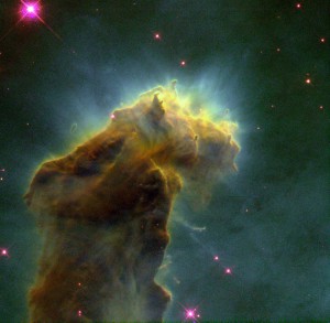
This eerie, dark structure, resembling an imaginary sea serpent’s head, is a column of cool molecular hydrogen gas (two atoms of hydrogen in each molecule) and dust that is an incubator for new stars. It is found in the “Eagle Nebula” (also called M16 — the 16th object in Charles Messier’s 18th century catalog of “fuzzy” permanent objects in the sky), a nearby star-forming region 7,000 light-years away in the constellation Serpens. The picture was taken on April 1, 1995 with the Hubble Space Telescope Wide Field and Planetary Camera 2.
Photo Credit: NASA
“Images engage us in ways that words cannot,” write Felice Frankel and Angela DePace in Visual Strategies: A Practical Guide to Graphics for Scientists and Engineers. Frankel, a research scientist at the Center for Materials Science and Engineering at MIT, and DePace, assistant professor in the department of Systems Biology at Harvard Medical School, compiled a collection of science’s most illustrative graphics with the intention of empowering the non-graphic designer scientist or engineer be able to create the right graphic for the right type of work.
Representing scientific and engineering data well can mean the difference between winning a proposal or losing one, exposing a new finding or blowing right past it, getting a point across or confusing the audience. By identifying visual basics in what the authors call the “tool box,” Frankel and DePace deconstruct the strengths and weaknesses of a variety of published images. From trees to bees to galaxies, the authors use these examples to illustrate how the elements within each graphic could be modified or adjusted to illustrate form, structure, process, chronology, or bring to light comparisons or contrasts.
For a closer look, a chapter of case studies shows how researchers have done everything from reimagining the Venn diagram to making the invisible visible in a paper on dark matter. As the frequency of electronic publications increases and the interactivity of online content evolves, the guide also provides insights about the creation of interactive graphics.
The authors employ stories and interviews with the scientists who created the graphics, and by doing so they capture both the end result and the process it took to convey “…all necessary information, exclude unnecessary information, and make use of your reader’s preexisting knowledge without being confined by it.”
Learn more about Visual Strategies.


