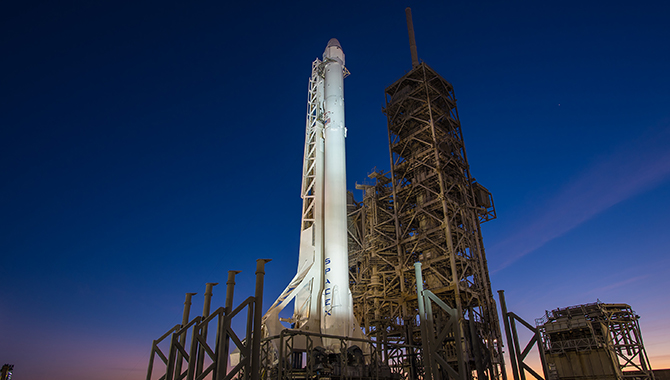


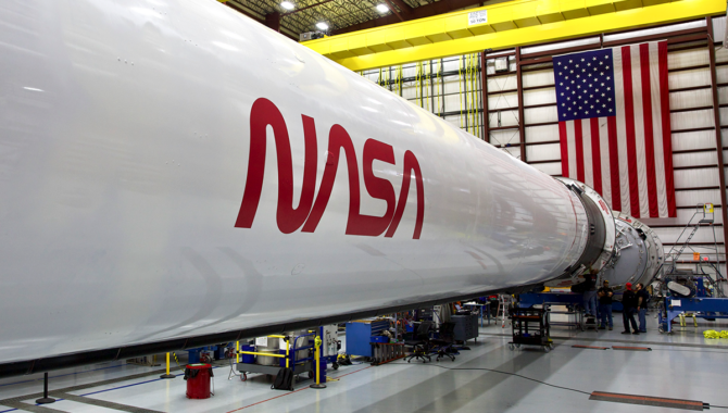
The Falcon 9 rocket that launched SpaceX’s Crew Dragon Demo-2 mission marked the return of NASA’s sleek logo, sometimes called “the worm” as a complement to the venerable Insignia, sometimes called “the meatball.” Photo Credit: SpaceX
Designer receives honor for advancing NASA mission.
When Artemis II roars off the launch pad carrying four astronauts to the Moon, including the first woman and the first person of color ever to travel the more than 230,000 miles from Earth, the rocket will bear two of the most iconic emblems in the world—NASA’s Insignia and NASA’s Logotype.
NASA’s Insignia is the venerable blue circle, emblazoned with stars, a white loop that is evocative of orbit, and a bold, red V that refers to the agency’s role in advancing aeronautics. James “Jim” Modarelli, a graduate of the Cleveland Institute of Art, designed the insignia. Modarelli was an employee of the National Advisory Committee for Aeronautics when it was absorbed by NASA in 1958. He submitted his design following an open call for employees to create a logo for the new agency. That logo adorned every Mercury, Gemini, and Apollo mission.
The origin story for NASA’s Logotype begins in 1972, the year the final Apollo missions returned from the Moon. That year, the National Endowment for the Arts (NEA) kicked off the Federal Graphics Improvement Program, a sweeping effort to modernize and bring artistic flair to the logos of government agencies. More than 40 logos were developed, including the eagle of the United States Postal Service and emblems for the U.S. Veteran’s Administration, Federal Energy Administration, and the Internal Revenue Service.
None is more iconic than NASA’s Logotype. It was created by a small firm founded by designers Richard Danne and Bruce Blackburn in 1973. Danne & Blackburn received an RFP from the NEA in 1974 to rebrand NASA’s logo.
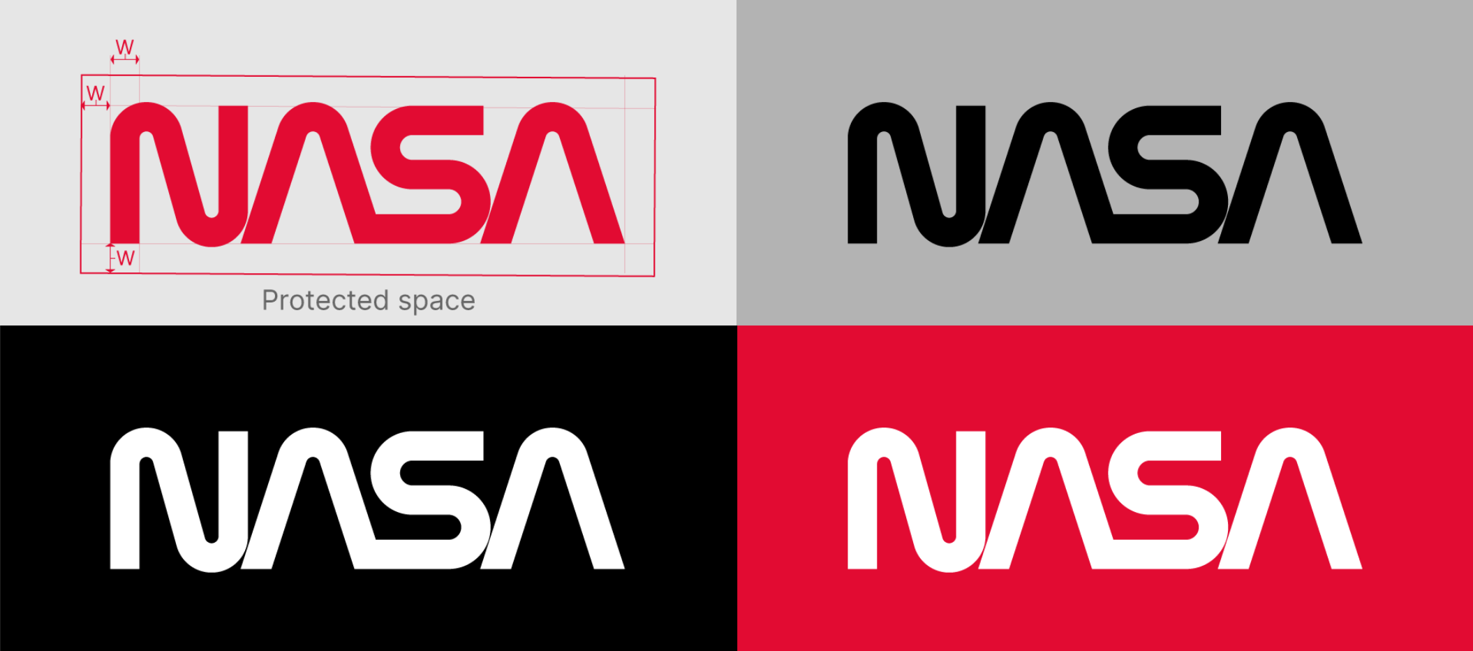
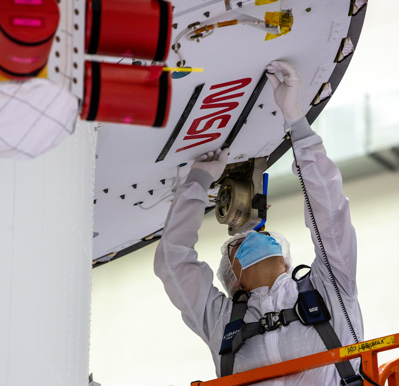
This example illustrates acceptable uses of the NASA Logotype and protected space requirements.
Credit: NASA
“It starts with a huge shock and surprise,” Danne recalled in a recent NASA event honoring him. The year before, Blackburn had designed the logo for the upcoming U.S. Bicentennial and the success of that effort likely played a role in the large opportunity for the small firm. “…We think that’s one of the reasons that we got invited. A firm of five people. Really tiny. And all of a sudden, this RFP drops out of nowhere and we’re thrilled. And we have about a week to respond. And ironically, it’s a verbal proposal.”
The firm didn’t have to wait long after submitting its proposal, Danne recalled. “And then maybe they took another two weeks or something like that, and then they dropped a bomb on us that we were selected to do it.”
In the next two months, the firm focused on a bold choice. It would propose a single elegant symbol to represent a sweeping agency with 10 centers spread across the country working at the forefront of space exploration, aeronautics research, and scientific advancement. Stylized, bold red letters against a white background. Both “A”s are sans crossbar, evocative of the nosecones of spacecraft and airplanes, the first “A” and the “S” joined together in a display of dynamism.
Graphic designer, design critic and educator Michael Bierut was a first-year student at the University of Cincinnati when he first saw the new logotype in 1975. “Design students in those days felt that they were enlisting in this great cause, which was to modernize the world … and to take it forward into an optimistic second half of the 20th and indeed in the 21st century. And this symbol was a beautiful demonstration of what that might look like,” Bierut said at the event honoring Danne.
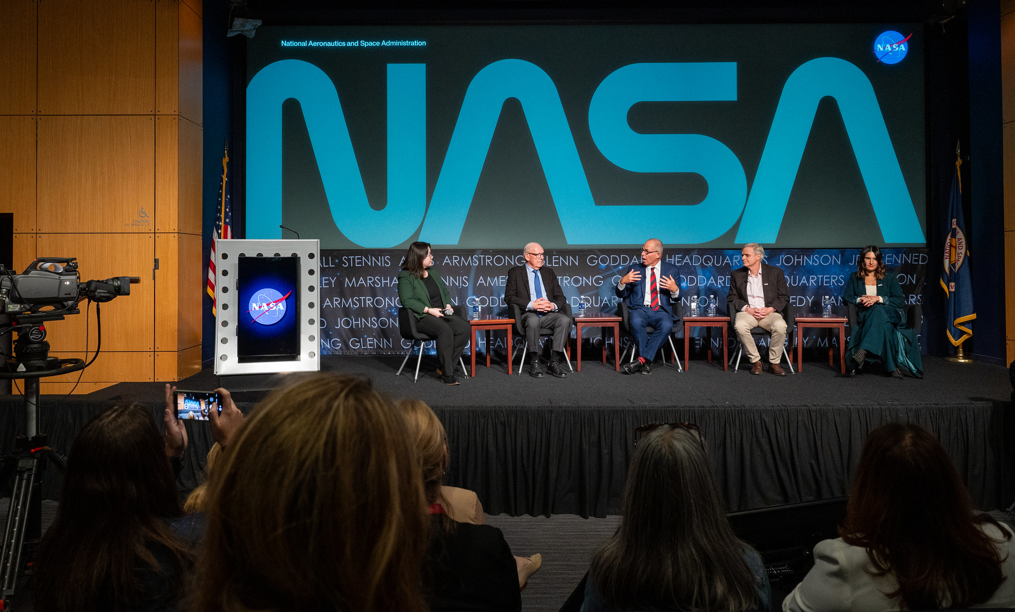
From left to right, moderator and Washington Post design reporter Shelly Tan, creator of the NASA worm logotype Richard Danne, Pentagram designer Michael Bierut, NASA entertainment and branding liaison Bert Ulrich, and Amazon Music head of live event merchandise Julia Heiser, participate in a panel discussion during a Richard Danne dedication event, Monday, Nov. 6, 2023, at the Mary W. Jackson NASA Headquarters building in Washington.
Photo Credit: NASA/Keegan Barber
“And so, I would say from the minute I saw it, I understood all those things that it was meant to represent. It’s modern. It’s like one sleek path. And in retrospect, I realize that it has this amazing other characteristic, which is that, to put it very simply, a 4-year-old can draw it. And if you’re talking about seizing the imagination of the next generation, the generation after that, that sort of capacity to inculcate them in the excitement, to reduce it to a simple shape like that is just really thrilling.”
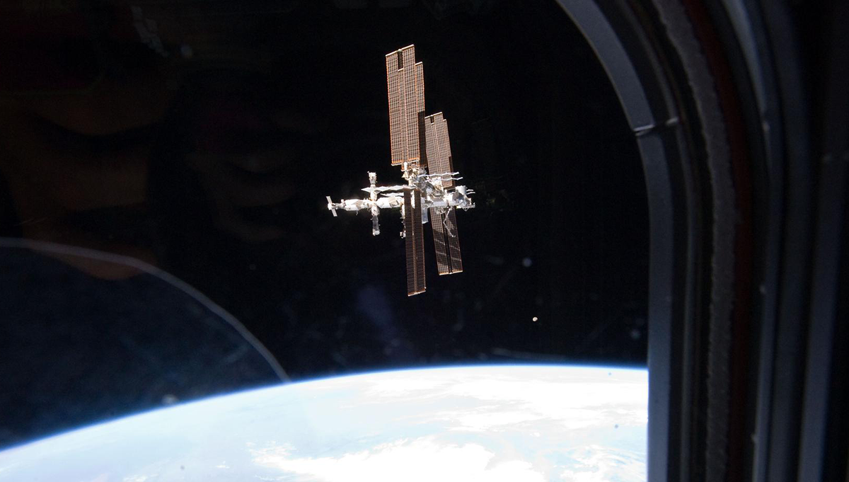
NASA’s iconic “worm” logo and European Space Agency (ESA) logo have been added to the aft wall of Orion’s crew module adapter on September 20, 2020, ahead of NASA’s Artemis I mission.
Photo Credit: NASA
The simple shape, presented in a precise color, not only captured the public’s imagination, but solved very practical concerns. The logotype was legible from very far away and it printed exceptionally well. “The printing in those days was so atrocious. … So, the simplicity was obvious as propulsion, and technology, and all that movement. But we were also trying to make it useful so that you couldn’t destroy it,” Danne said.
Danne & Blackburn delivered the logotype with a comprehensive manual for its use and reproduction. The manual helped graphic designers at NASA’s centers to better understand how to use the logotype in their own projects. Decades later, graphic designers and space enthusiasts still revere the manual, which includes illustrations of the logotype on cars, trucks, spacesuits, uniforms, and more. So much so, in fact, that a 2015 Kickstarter campaign to crowdsource a reprint of the manual raised $941,966, about five times its original goal.
The logotype, which became known as “the worm,” was NASA’s primary logo from 1975 until 1992, when the agency retired it and returned to the insignia, known as “the meatball.”
“Almost 30 years later, the worm got a second life on the Demo-2 mission,” said David Rager, NASA’s Creative Director, referring to the mission that carried astronauts Robert Behnken and Douglas Hurley to the International Space Station, validating SpaceX’s human transportation system for NASA’s Commercial Crew Program.
“And from there, we looked to see how these two incredible logos could coexist harmoniously,” Rager explained, at the event honoring Danne. “Aesthetically, some might say they come from different planets. But we found with just the right balance, they complement each other fantastically. In an aircraft, we place the meatball near the crew, towards the front of the craft. And the worm rests on the larger surface for support and legibility. On our space launch system, the insignia is placed up near the crew, and the worm, large and bold on the boosters.”
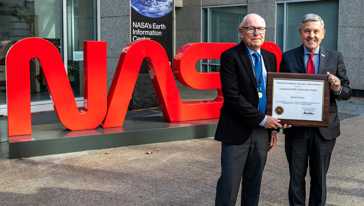
Richard Danne (left), designer of the NASA Logotype, poses for a photo with former NASA Associate Administrator Bob Cabana. Richard received the Exceptional Public Achievement Medal for his outstanding achievement in creating the NASA worm logotype, Monday, Nov. 6, 2023, at the Mary W. Jackson NASA Headquarters building in Washington.
Photo Credit: NASA/Keegan Barber
On November 6, NASA presented Danne with the Exceptional Public Achievement Medal, which recognizes the accomplishments of non-government employees who contribute to the mission of NASA.
“Creating the worm for NASA has been a singular achievement in my own career and in the history of design. It has not always been easy, but it was a glorious experience and I feel fortunate to be part of the NASA family and to have helped the agency achieve its missions and goals,” Danne said.