
![]()
By Helen-Nicole Kostis and Don Cohen
At the start of the video, we see a bright sliver of Earth against a background of the star-speckled blackness of space.
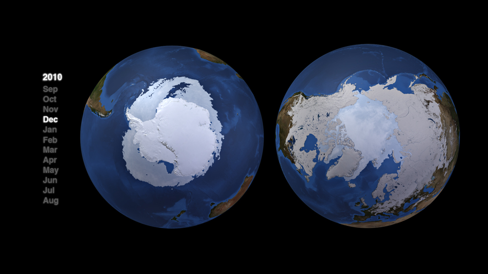
Snow and sea ice in the Northern and Southern Hemispheres grow and shrink at exact opposite times of year, constantly out of phase.
Image Credit: NASA/Goddard Space Flight Center Scientific Visualization Studio
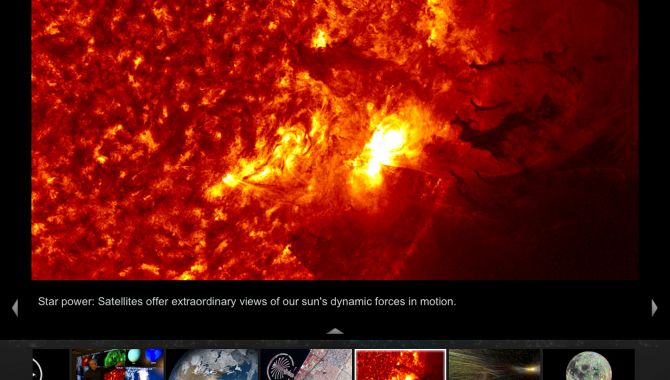
As we move toward the turning globe, a now-familiar sunlit scene is revealed: the swirls of white cloud, blue oceans, and brownish continents first seen when Apollo astronauts photographed Earth from space. We zoom closer, moving in on the north Pacific, while a narrator explains that Earth’s clouds reflect solar radiation and that atmospheric pollution can increase cloud cover. As we come even closer, we begin to see thin, curved tracks of cloud, which the narrator tells us form around sulfate particles in the exhausts of ships as they cross the ocean. These clouds have been recorded and revealed by the moderate resolution imaging spectroradiometer (MODIS) on NASA’s Terra and Aqua satellites.
But no spacecraft has followed the trajectory that has brought us to this spot above the Pacific. The video has been constructed of hundreds of separate images. Even that first view of the cloud-covered sunlit Earth is made up of several hundred images artfully stitched together. Creating high-quality computer graphics and videos from massive quantities of data from NASA satellites and other spacecraft is what we do at NASA’s Scientific Visualization Studio (SVS)1 at the Goddard Space Flight Center.
The Process
It took two weeks of full-time work to build the two-minute video that incorporates data received from MODIS. The time it takes to develop a visualization varies from project to project and as a result of many different parameters. Some visualizations may take a day; other, complex ones may take many months.
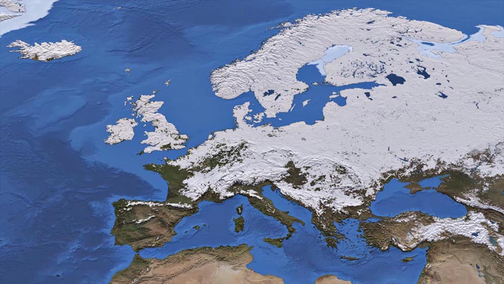
In this visualization from “Let It Snow,” a massive snowstorm covers much of continental Europe and the United Kingdom on December 29, 2010.
Image Credit: NASA/Goddard Space Flight Center
At SVS, we use the same computer graphics animation software Pixar employs to create animated films like Toy Story and Wall-E, but we have added our own software modules to the commercial software to ensure the images we create reflect as accurately as possible the data they are based on. Faithfully representing that data is as essential to the value of scientific visualization as telling a good science story. In the recently published paper Scientific Storytelling Using Visualization ,2 we describe in detail the production process at SVS, including skill sets, techniques, types, formats, and the breadth of our work. In the MODIS video, we even made sure that the stars in the background matched what an astronaut would actually see from that point in space. Although that view is not, strictly speaking, part of the MODIS “story,” portraying the scene accurately helps establish the credibility of the visualization as a whole, just as a random or fictional pattern of stars would undermine it.
Not every detail of the video can be derived directly from satellite data, however. There are moments of transition—for instance, when the “camera” zooms in—for which no data exist. And there are data from different sources with different resolutions that must be seamlessly stitched together. One of the big challenges in scientific visualization is understanding how to fill in those gaps and connect those disparate sources without compromising the accuracy of the video as a whole, creating, in this case, a smooth transition from a more distant view to a closer one. An accurate portrayal of the science is essential, but so is the artistic component. An artist’s understanding of composition, color, and lighting helps guide the choices we make. So does a kind of educated intuition—a hard-to-pin-down sense, based on a lot of experience, of what feels right. The process involves a lot of trial and error, and frequent consultation with colleagues. At SVS we work in an open environment, so it is easy—and common practice—to discuss among team members our problems and choices and consult each other on how to generate solutions. For example, in order to position the starfield background in the MODIS video, I collaborated with my colleagues Ernie Wright and Greg Shirah. Ernie, an amateur astronomer, has “starfield” expertise while Greg developed software to put everything in place accurately. Every project brings with it unique issues and challenges.
… We even made sure that the stars in the background matched what an astronaut would actually see from that point in space. Although that view is not, strictly speaking, part of the MODIS story, portraying the scene accurately helps establish the credibility of the visualization as a whole, just as random or fictional pattern of stars would undermine it.
Learning the Trade
I have been working at the SVS since 2007. Led by director Horace Mitchell, SVS is a world-class computer graphics production studio for scientific visualization of Earth, planetary sciences, and heliophysics. The knowledge and infrastructure that reside in the SVS are impressive. The backgrounds and expertise of SVS members are diverse, but we share a passion for computer graphics, an appreciation or passion for art, and an interest or expertise in science.
I have a passion for bringing moving images to life and relish the challenge of balancing art and technology while maintaining the integrity of the data. Combining art and technology to serve science is an exciting challenge. I was lucky to begin developing the necessary skills during my years of graduate work, when I found myself at the Electronic Visualization Laboratory (EVL) at the University of Illinois at Chicago (UIC). Since its founding in 1973 as the Circle Graphics Habitat by artist and physicist Daniel Sandin and computer scientist Tom DeFanti, EVL has been a bridge between technology and the arts. A joint program of UIC’s College of Engineering and the School of Art and Design, it was one of the nation’s first such labs.3
The best way I can describe EVL is to call it an endless creative playground. EVL is not only home to some wonderful people, but it is also an environment for visionaries who experiment with advanced visualization and networking technologies and support high-tech artistic experiments in an open culture. The lab emphasized and celebrated collaboration between art and technology, high-quality work, immersive experiences, and artistic vision. During my studies for a master of fine arts in electronic visualization, I worked and studied under the mentorship of Daniel Sandin, who is a computer graphics pioneer and a visionary artist. Dan builds the technology4 and develops the software to make his art a reality. Working with him and in EVL fed my own interests in artworks5 that could not exist without the cutting-edge technologies used to create them.

The NASA Viz app shares scientific stories through images, animations, articles, and more.
Image courtesy of Helen-Nicole Kostis
Art is not my only passion. In various phases of my life, I taught in schools and community colleges and connected with students. I am deeply interested in merging art and technology for informal educational purposes, especially building novel platforms that distribute engaging scientific storytelling content using visualization. An example of such a platform is the NASA Visualization Explorer (NASA Viz) iPad app,6 which we released on July 26, 2011.7
A group of media experts at Goddard brought this app to life. The multidisciplinary team includes members of the SVS, the Science Data Processing Branch, and Goddard Television. With story contributions from writers, producers, data visualizers, and scientists, the app features images, videos, and text that provide information from NASA’s science research projects in a clear and lively form. The stories vividly portray findings in Earth science, ranging from wind and water patterns to seasonal changes in vegetation to fires to shrinking glaciers, as well as discoveries about the sun, planets, moons, and the universe beyond our solar system. As of May 2012, more than 600,000 users have downloaded the NASA Viz app.
The contribution of artists in technology projects to science is not something new, but it is definitely not mainstream. Scientific and technology fields have their own metrics for measuring contribution and success, but what about the contribution of arts? One of my other interests is to work with fellow artists who are collaborators in science education projects and discover how we can articulate the contribution of such fields. A first attempt toward this direction is a collaborative paper, Media Arts in Support of Science Education.8
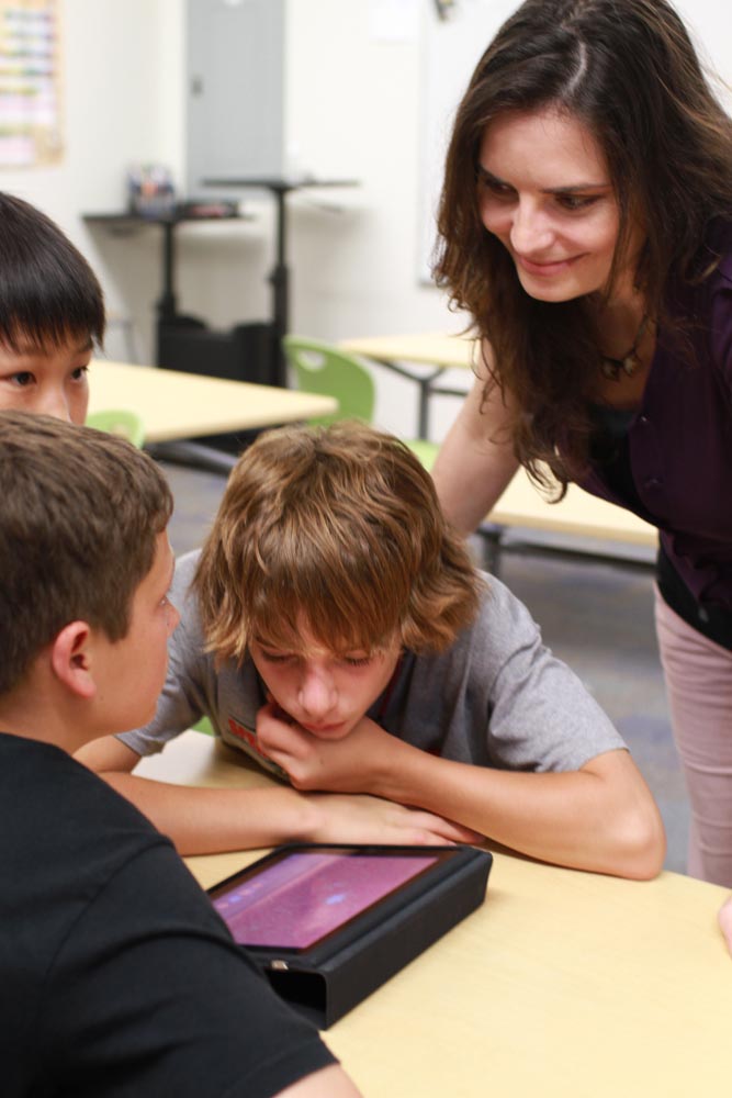
SVS visualizations help share the story of science easily with others, including the next generation of explorers. Here, visualizers seek feedback on the NASA Viz app from middle-school students.
Photo Credit: NASA/Katherine Lewis
Visualizations vary in subject area, style, and duration. For instance, the “Snow Leads, Sea Ice Follows” and “Let It Snow9 set of visualizations developed collaboratively with colleague Cindy Starr have been especially popular in the educational community, as they showcase how seasons change, and especially the difference in seasons between Arctic and Antarctic regions. These visualizations were produced in close collaboration with NASA scientist Thorsten Markus and are now used in many educational events. For the development of these visualizations, layers of different data sets blend together, including bathymetry in the oceans, Next Generation Blue Marble in the Land, AMSR-E sea-ice data, and Terra MODIS daily snow cover.
An example of a powerful educational and scientific use of these visualizations is in a recent live event combining music, art, and science with education in the NASA-sponsored program “Beautiful Earth: Learning and Experiencing Science in a New and Engaging Way.” Visualizations of snow cover and sea ice over the poles showcase dramatic changes occurring over seasons and demonstrate the relationship of snow cover and sea ice.
Principal investigator Valerie Casasanto believes that “audiences wont be able to grasp such complex scientific concepts or even pay attention unless they are visually appealing. Through the use of SVS visuals combined with music, an audience can understand a scientific concept without being lectured to. In one look, the whole story is told. This may help inspire young people to study these sciences or take action for better stewardship of our home planet.”
The Audience for Scientific Visualization
The primary purpose of works like the MODIS video and the “Pulse of Snow and Sea Ice” visualizations are to help NASA scientists advance their research and support outreach communication and scholarly work (presentations, publications). The visualizations also support NASA’s education and public outreach activities that engage the public about research efforts. They present the story of scientific findings in a form that students and the public can readily grasp. Our job comes down to effective and accurate storytelling—creating a visual narrative that will be informative, visually compelling, and scientifically accurate.
The visualization-driven products are archived in the SVS repository (svs.gsfc.nasa.gov), which is a free and publicly accessible database with more than 3,000 entries. The products span many visualization forms, including 2-D, 3-D stereoscopic, Science on a Sphere, Hyperwall, Dome Show, and even touch display. Each production includes various formats, including frame sets, still images, movies, and, when appropriate, data in a wide gamut of resolutions. Upon release, the products often take on a life of their own, since the public can use them freely and without restriction.
Related Links
- NASA Visualization Explorer App
- Let It Snow
- Let It Snow (Video)
- Snow Leads, Sea Ice Follows
- Snow Leads, Sea Ice Follows (Video)
- Scientific Visualization Studio, svs.gsfc.nasa.gov.
- Kwan-Liu Ma, Isaac Liao, Jennifer Frazier, Helwig Hauser, and Helen-Nicole Kostis, Scientific Storytelling Using Visualization, IEEE Computer Graphics and Applications, January/February 2012, 1219, doi.ieeecomputersociety.org/10.1109/MCG.2012.24.
- Stuart Luman, Future World, UI C Alumni Magazine, Winter 2011, www.uiaa.org/uic/news/uicalumni/1111a.html.
- Video Data Bank, Dan Sandin, www.vdb.org/node/288.
- Another Language Performing Arts Company, InterPlay: Loose Minds in a Box, 2005, www.anotherlanguage.org/interplay/lmib.
- NASA Visualization Explorer, svs.gsfc.nasa.gov/nasaviz.
- Wade Sisler and Michael Starobin, NASAs iPad App Beams Science Straight to Users, Goddard Release No. 11-044, www.nasa.gov/centers/goddard/news/releases/2011/11-044.html.
- Daria Tsoupikova, Julieta Aguilera, Helen-Nicole Kostis, Tina Shah, and Brenda Lopez Silva, Media Arts in Support of Science Education, International Symposium on Electronic Art 2012 (to appear).
- NASA Scientific Visualization Studio, Snow Leads, Sea Ice Follows, svs.gsfc.nasa.gov/vis/a010000/a010800/a010881/index.html; Let It Snow, svs.gsfc.nasa.gov/vis/a010000/a010800/a010850/index.html.