


By Ray Morgan
Most program/project and task managers use the Gantt chart format for their graphic display of project plans and actual accomplishments. It is a simple tool to use, and displays a lot of information on a computer screen. Most modern, commercial computer programs allow one to show interdependence, resource allocation, and roll-up of tasks and subtasks on the Gantt chart, at varying degrees of clarity.
From the standpoint of communicating the overall picture of what needs to be done, when and why, to both the project team and our customers, however, I’ve found the PERT chart to be better. PERT stands for “Program Evaluation and Review Technique,” but the charts are also called “network diagrams” and “precedence charts.” Probably, the latter terms are more descriptive of the charts’ functions.
In our solar aircraft development program, we used two types of precedence charts extensively for communication of program/project plans. The solar aircraft development was a part of the Environmental Research Aircraft and Sensor Technology program (ERAST), managed by NASA’s Dryden Flight Research Center. A top-level program chart, spanning eight years, is shown in Figure 1.
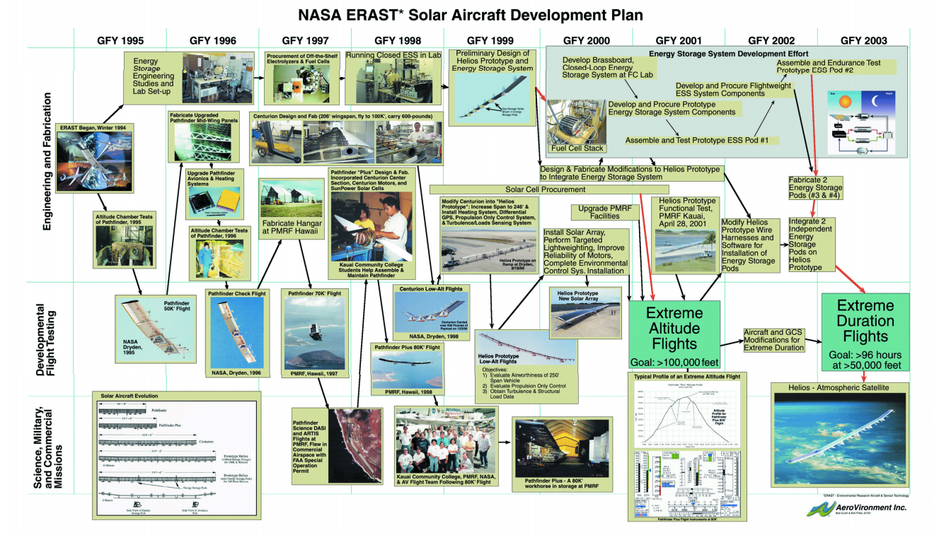
Figure 1: NASA ERAST* Solar Aircraft Development Plan Image courtesy of Aerovironment Inc.
This type of chart was extremely useful for communicating the overall program milestones leading to the end goals. It shows the Level II project elements that make up the overall solar aircraft program. Creating the chart on a simple computer drawing program, rather than using project management software, allowed us to use representative graphics prior to an event actually occurring and to insert digital photographs of events as they were accomplished. Since it was updatedinfrequently, the automated features of a canned project management program were outweighed by the value of flexible use of graphics. Also, most automated PERT chart programs do not show a time scale.
Having access to a large, color plotter enabled us to make banner-sized depictions of the program and place them on the walls of our shop and hangar for all the team to see. The chart was much more than window dressing, as we often referred back to it in team meetings to help redefine the importance of a current task and to see how it fit into “the big picture.” This became a very valuable tool for the team.
With pride, we saw blocks filled in with actual pictures of our accomplishments (as well as programmatic re-adjustments when necessitated by problems). Enthusiasm for accomplishing the next goal was reborn each time we looked at the graphics on our wall. The fact that these charts were actually updated, and did not just become faded wallpaper, made them more evocative to the team. What’s more, this top-level view of the program was invaluable in “selling” the program to our customers in the Agency food chain, as well as members of Congress and the public at large.
Figure 2 illustrates the use of the precedence chart at a working level. This particular example shows the chart as used in the field with the Helios flight test team during our attempt to reach 100,000 feet above sea level in 2001. This chart goes down to Level IV from a program standpoint (Level III from a project view). While much of the effort to organize the precedence chart is manual manipulation (when using typical project management software that runs on a desktop computer) and requires some “grunt work” on the part of the manager, this manual approach provides more flexibility in organizing the chart in meaningful ways.
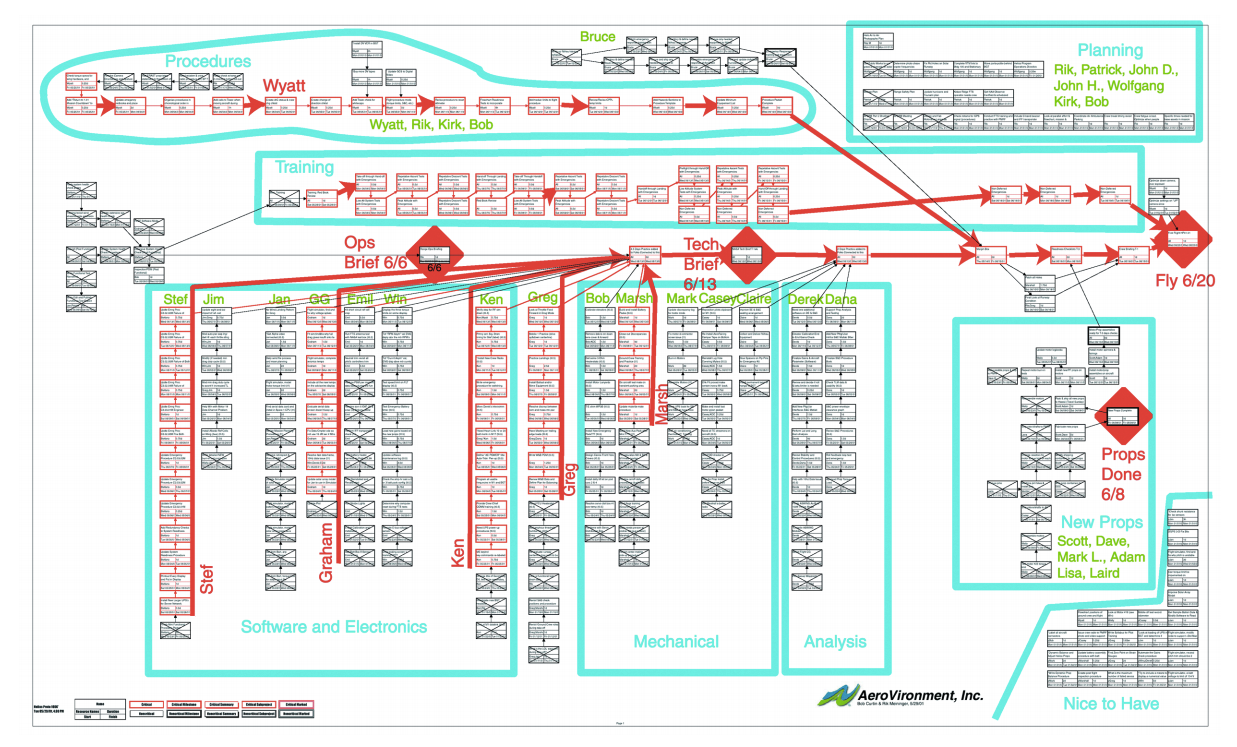
Figure 2: Helios Flight test team working chart. Image courtesy of AeroVironment Inc.
This same chart also illustrates how the project manager can group tasks to the next higher level (see the large blue outlines), such as procedures, software, etc. In addition, the key milestones are evident within the red diamonds (ops brief, tech brief, etc.). The task manager for each set of sequential tasks is shown in green letters at the top of each string of tasks. The software automatically calculates the critical paths (shown in red), and the responsible persons for tasks on the critical paths have their names shown clearly in red as well, to emphasize their situation to the team. We were able to show a group of “Nice to Have” tasks in the lower right corner, which would be worked if people became available.
In essence, a complete virtual model of the project is shown in one large sheet, and it is much more meaningfully organized than if we had just printed out a large Gantt chart with several hundred items listed sequentially. This model allows the project manager and subordinate task managers to visualize and formulate plans, and see graphically how they work.
We put our chart on the side of a large container right in the hangar, next to the flight test crew and the airplane. When posted, it becomes a valuable, graphic depiction of the work plan, interdependencies, milestones and people on the critical path (as well as which ones may need help). It also allows the team to mark it up interactively, adding tasks that come up when necessary and crossing/signing-off tasks as they are completed. We usually incorporated these changes into the computer model and reprinted it once or twice a week during flight tests.
In summary, the PERT or precedence chart (a.k.a. network diagram) provides both a virtual model for project and task managers to refine their plans as well as an excellent graphic depiction of the plans and project status to the team and their customers. It is more work than the standard Gantt chart, but it is extremely helpful in the effective execution of the project. The precedence chart graphically clarifies the plan, and allows team members to see themselves as integral to the project.
Riding high
“Before too long, solar aircraft will be capable of subsonic flight in the stratosphere. A new industry is on its way,” says Ray Morgan — and he should know. Morgan has been a pioneer in the development of next generation aircraft since the 1970s. He has been integrally involved in NASA’s efforts to develop sustainable solar-powered aircraft on the Pathfinder and Helios project (Helios is pictured on the cover of this issue). According to Morgan, the NASA Environment Research and Sensor Technology (ERAST) program is successfully developing a new type of propulsion for aircraft, one uniquely appropriate for the 21st century. Soon, because of this program, many missions now requiring rocket launches for jet aircraft will be accomplished more economically in terms of dollars and environmental impact.
About the Author
 |
Ray Morgan has recently retired as Vice President of AeroVironment, Inc., where he established the Design Development Center in 1980, serving as Director until April 2000. He oversaw more than 75 projects and the development of over 50 unique vehicles, including over 35 Unmanned Aerial Vehicles (UAVs) during his tenure at AeroVironment Inc. |